Loading…
Logos, the animated mark, palette, and downloadable assets — for partners, press, and our own team. Everything here is safe to use per the guidelines below.
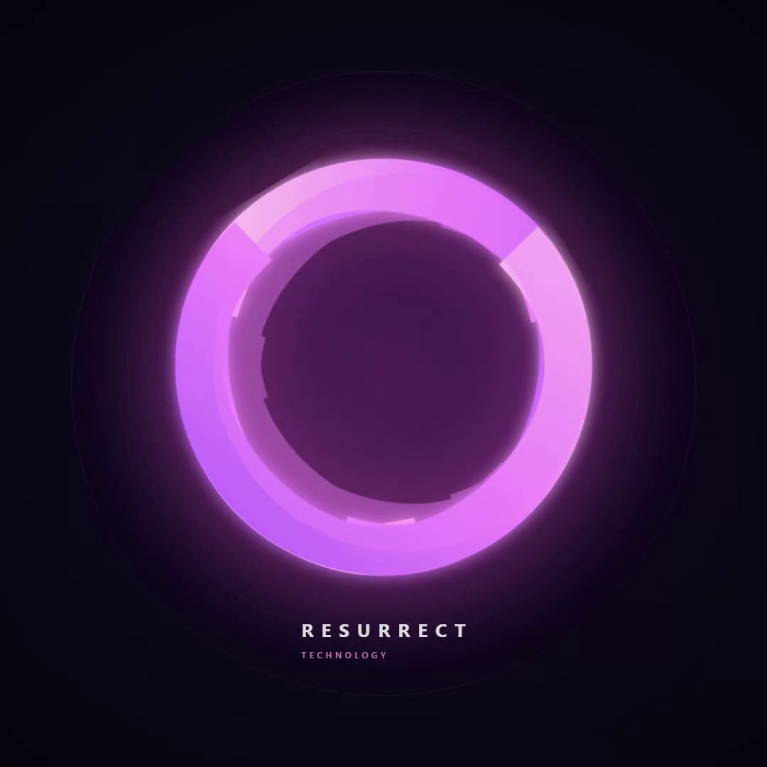
The whole mark spins clockwise while the outer glow trio counter-rotates and the inner accent ghost drifts and pulses. The layered motion is what makes it feel alive — not just rotating.
Pick the lockup that fits the space. All three render crisply at any size — vector-only, no raster fallback.
The phoenix emblem on its own. Use for favicons, avatars, app icons, square formats.
Primary lockup for headers, decks, and letterheads where width is available.
Tight spaces — footer bars, dense navigation, partner co-brand rows.
Magenta → fuchsia → purple on a phoenix-night base. The accent spectrum is reserved for the mark, CTAs, and emphasis — never body text.
Right-click → Save link as. For a master-resolution GIF or custom format, use the contact link above.
Five rules that keep the mark consistent across every surface.
Questions about usage, or need a format that isn't here? Get in touch.